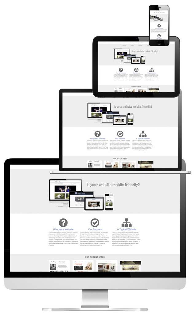
Is your website responsive or “Mobile Friendly”?
Right now consumers are using their mobile devices such as smart phones and tablets for most of their browsing needs. Traditional websites were designed to work well on your home or business personal computer. These traditional websites do not usually display well on mobile devices. You are usually presented with a screen where any content is too small to read without squinting, the menus are too tiny to use without zooming and generally, they are more of a nuisance to use. Most mobile users are unlikely to visit a website again if their viewing experience and performance is less than satisfactory.
 This is business we are talking about, who want’s to lose potential customers and clients because their website is not mobile friendly.
Responsive or “Mobile Friendly” websites by contrast are designed to work well with both both the desktop PC and mobile devices. They are designed to provide an optimal viewing experience, are easy to read and use. Responsive websites will adapt to the device that is being used and will provide easy reading with a minimum of resizing and scrolling. Images, text and content will automatically adjust to suit the viewing device being used.
All new websites we design now are “Mobile Friendly” and will work well with iPhones, Android smart phones, tablets and desktop PC’s in both portrait and landscape views.
If anyone is contemplating having a website designed for their small business then they should insist on their website being responsive. Business with older websites will most likely need to update their websites so they are responsive if they wish to stay competitive.
